From 2010-12 I printed a series of experiments which I shared with subscribers. After the eighth issue, I felt the experiment was over. These little books have either eight or twelve pages and are pamphlet-stitched. A handful of each edition remain.
Issue #1 A period when I was creating kaleidographic prints with type, & did the first quarterly by juxtaposing my drawings with my abstractions.
Issue #2 The birth of Farflungland…a cherished tale of mythotypography in which resistance to graphic dogmatism rallies around the demigod of type metal, Dingbatman.
Issue #3 Continuing with Farflungland oddities, here I reproduced one of their satirical literary magazines, Farflungland Review.…full of “…bandied words, rookie blunder jewels.”
Issue #5 This is a long verse riff done many years ago, here set experimentally with solar plate scratched images and a touch of color in the typography.
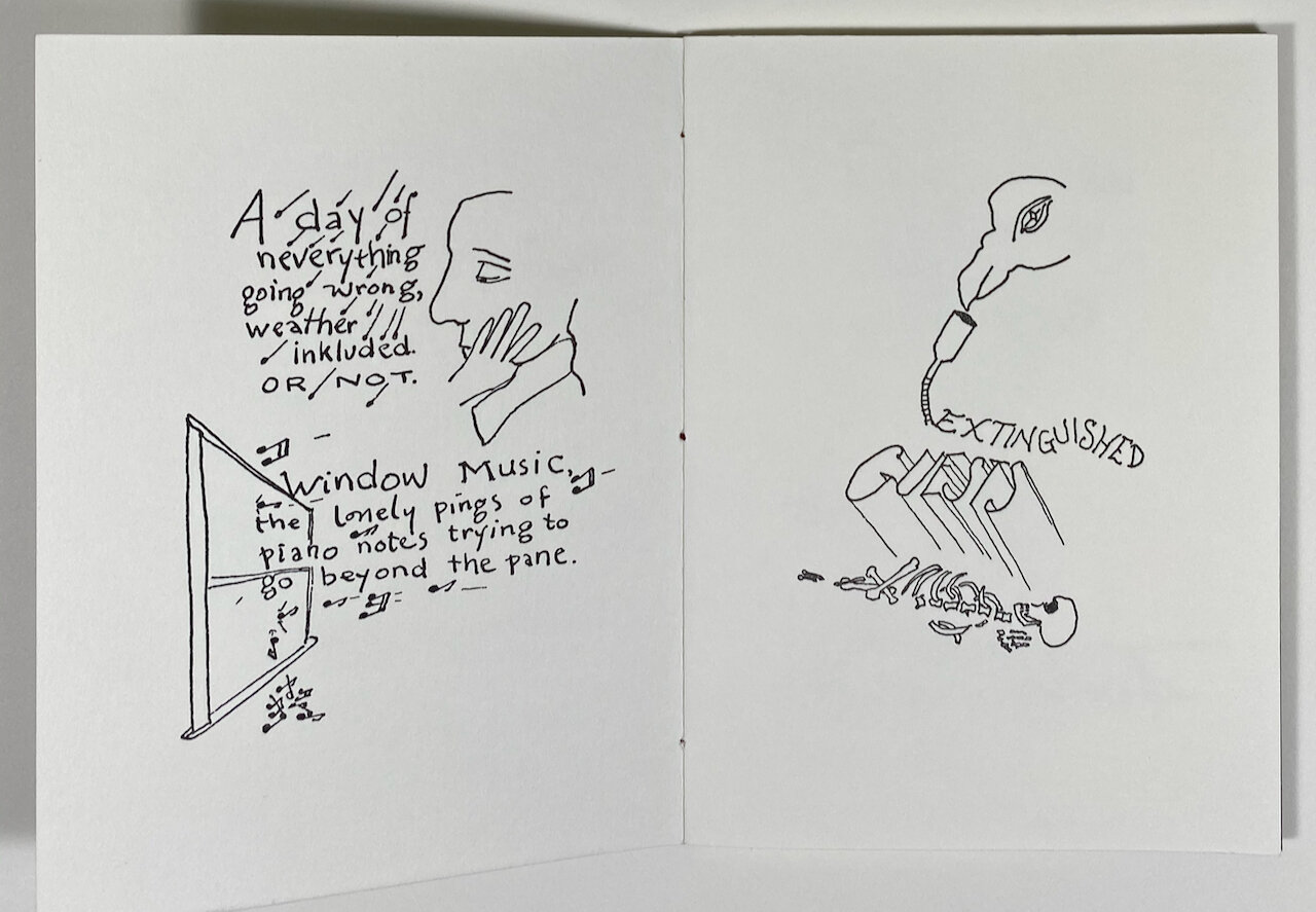
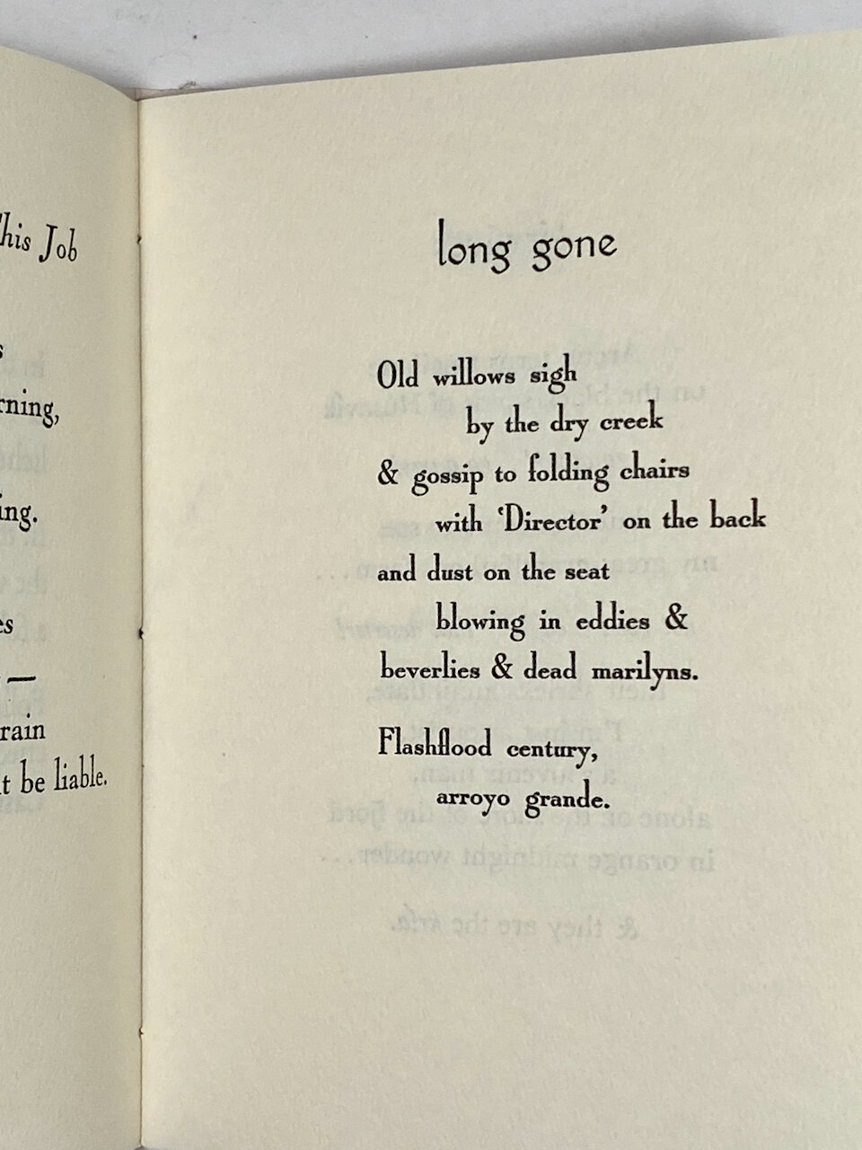
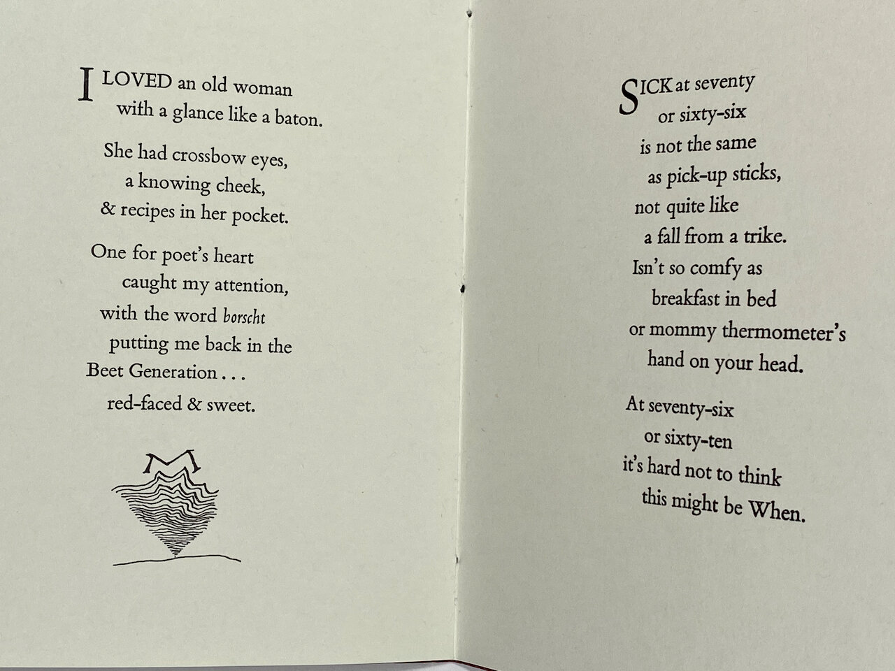
Issue #8 Knowing this would be the last issue, I just reverted to form: poetry chapbook. Tried out the use of large initial letters, added a few drawings.