Make it stand out
Whatever it is, the way you tell your story online can make all the difference.
Make it stand out
Whatever it is, the way you tell your story online can make all the difference.
Make it stand out
Whatever it is, the way you tell your story online can make all the difference.
inklings
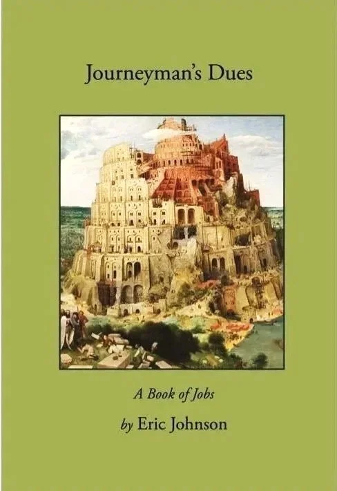
Most people on my mailing list only know of me as a letterpress printer. But, having retired from the printshop, last year I published a memoir of my life before that, as a union carpenter. This year I’ve published a collection of my art and writings from the time of the Pandemic, and I think its zany contents are unfamiliar to people apart from my close friends and family. So I thought to post a couple of bulletins as a preview.
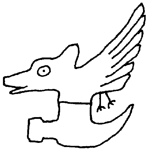
For over fifty years I’ve experimented with and studied media for fusing images and text, e.g. Wm. Blake’s illuminated work, Apollinaire’s calligrammes, N. American petroglyphs, comic artists & Tang Dynasty painter/poets. I was particularly inspired by the work of Kenneth Patchen, whose drawing-poems were so experimental and childlike that his words had vatic powers. I’ve drawn on many traditions, but always pull up short of mimicking or wanna-being. But will confess to envy when I look at Egyptian hieroglyphs or Chinese writing. Our alphabet is so…plain.
At times words come as if etched ahead of time and I leave them alone as calligraphic messages. But I am also influenced by the asemic artists who create ‘texts’ without semantic meaning nor even an alphabet. The method was/is improvisational immediacy. I rarely have an idea before putting ink to paper. But I think of them all as poems.
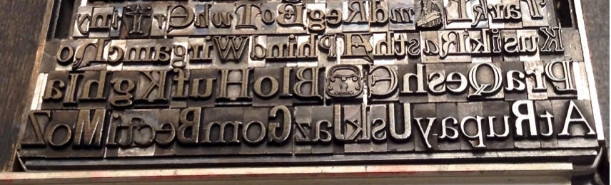
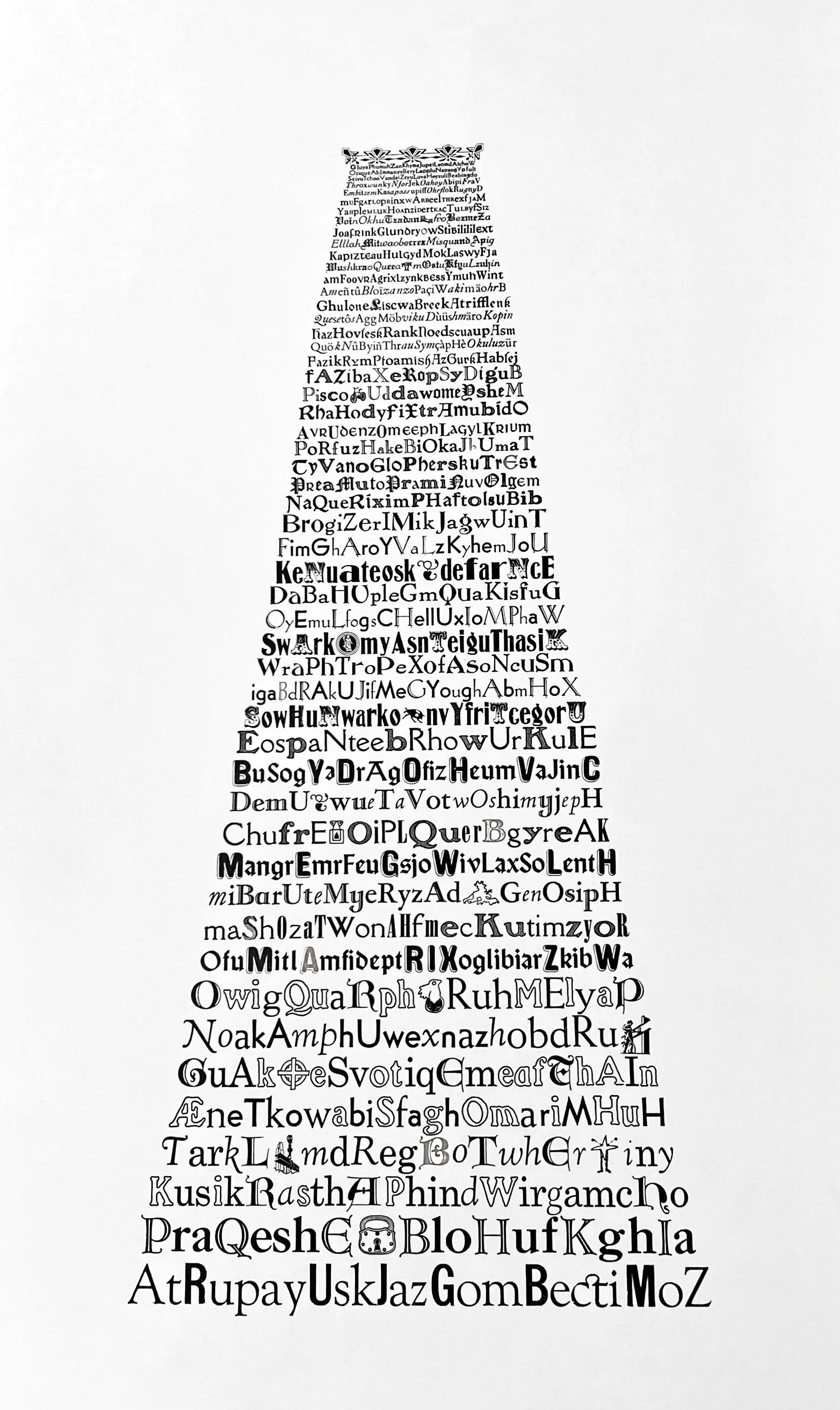
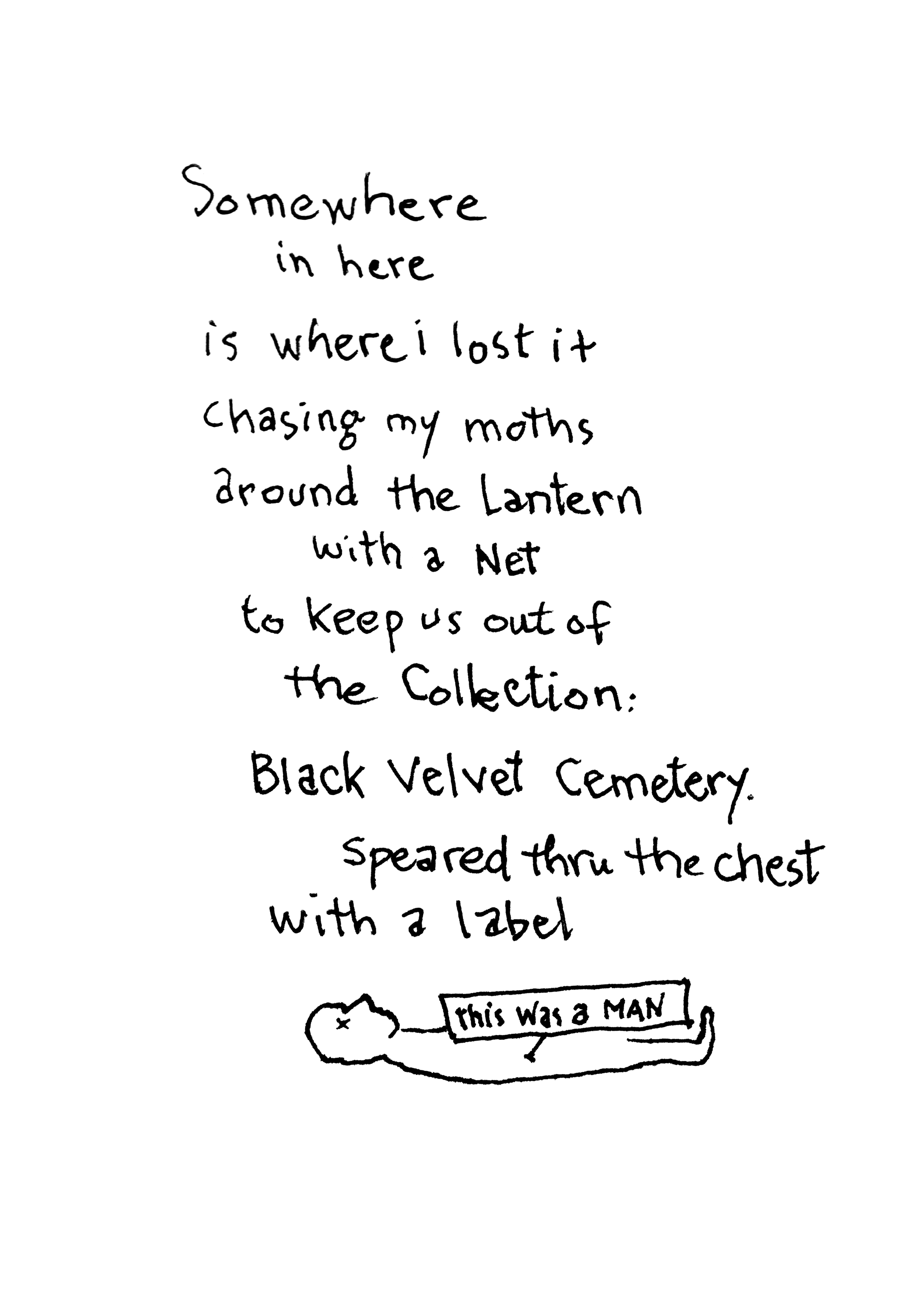
The images alongside here are from the book. You can see that the top piece is not readable language, and the ink is racing ahead of any thought. It’s part of a whole series I did in that year using a quill pen and homemade oak gall ink.
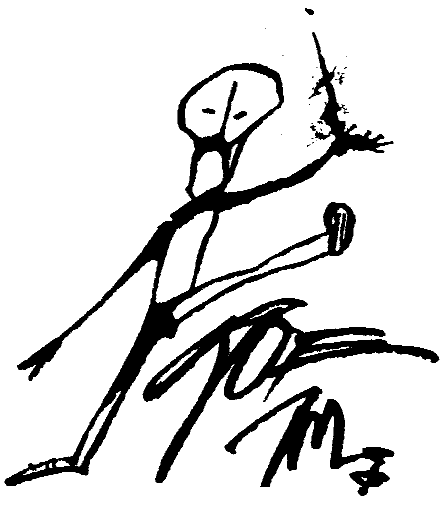
The second image is a line drawing with words appearing as vernacular & oracular messages. These kinds of drawings sometimes come to me with whole texts, often infused by my fascination with petroglyphs.
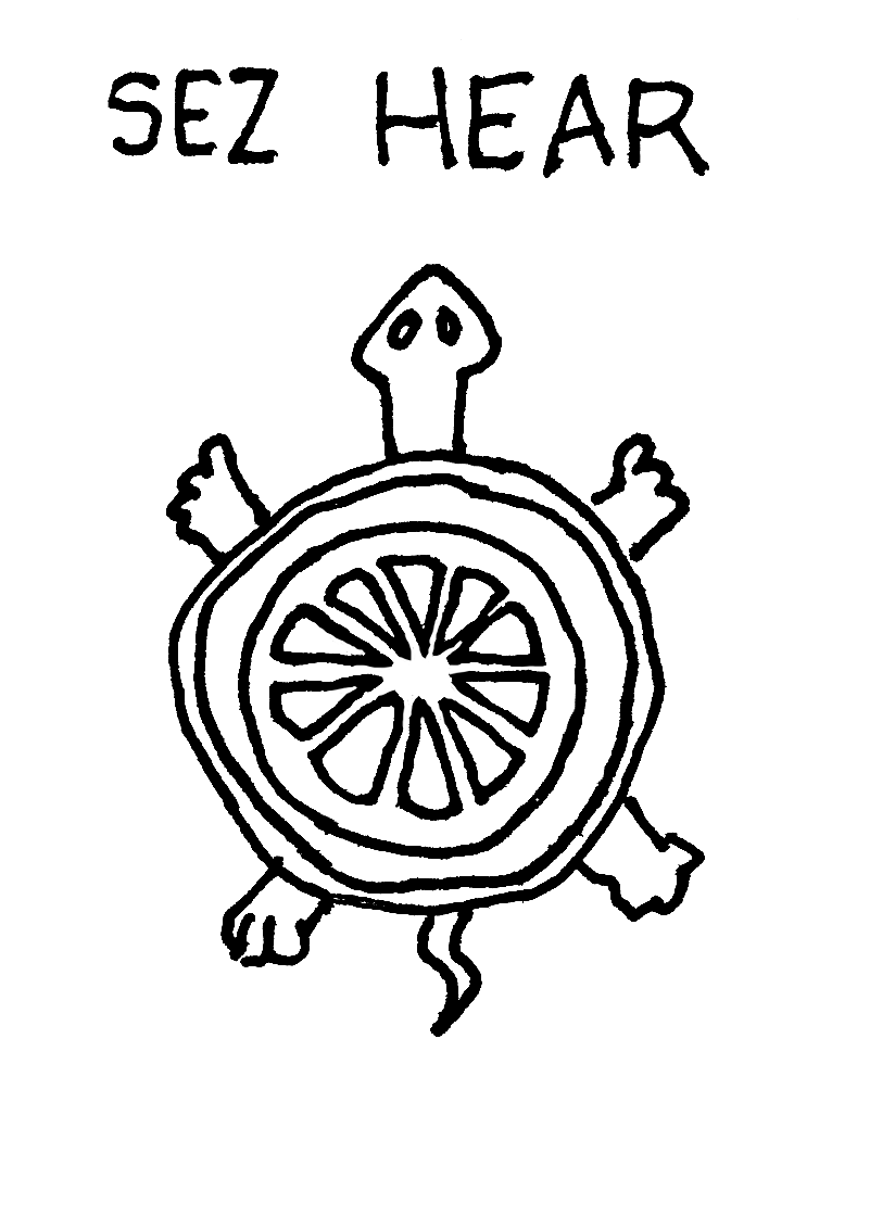
The last one is a pen&ink drawing-poem that found a metaphoric life as a mirror of itself. The poem ends up saying ‘don’t collect poems and put pins through them as if for an insect display.’ And of course it has itself been collected with all the other pages in my book, which is a sort of a merry-go-round in a larger collection.
I’ll go a bit further with this next time, but meanwhile, you can buy the book by clicking’purchase’ in the right margin above.
– ej